BRANDING | UX
BRANDING | UX
ENVIRONS DEVELOPMENT | 2018
ENVIRONS DEVELOPMENT | 2018
Environs Site Redesign
Environs Site Redesign
Environs Site Redesign
Delivering Modern Luxury for the Discerning Customer
Delivering Modern Luxury for the Discerning Customer
Project Overview
Project Overview
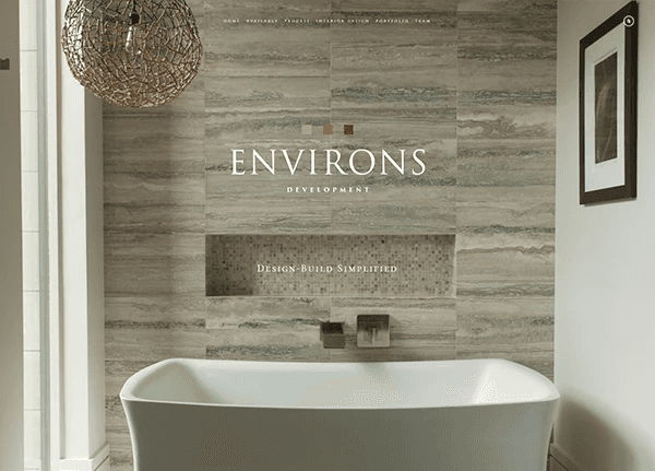
This is the job where I discovered my passion for user experience design. My client needed their website modernized and updated to amplify the brand and appeal to a discerning clientele by promoting the team, featuring the product, and explaining the luxury home development process.
I worked alone, overseeing everything from research to production; this included assisting in photo shoots, designing the site's new layout and flow, copywriting, and curating the web pages.
Research Overview
Research Overview
Being new to web design and knowing nothing about housing development, I set out to learn about Environs's industry, what separated their development process from their competitors, and what made a good website for other businesses in the industry.
I kickstarted the project with a brand analysis, competitor site audits, and countless site reviews.
Site Analysis
Site Analysis
BRAND AND MESSAGING
BRAND AND MESSAGING
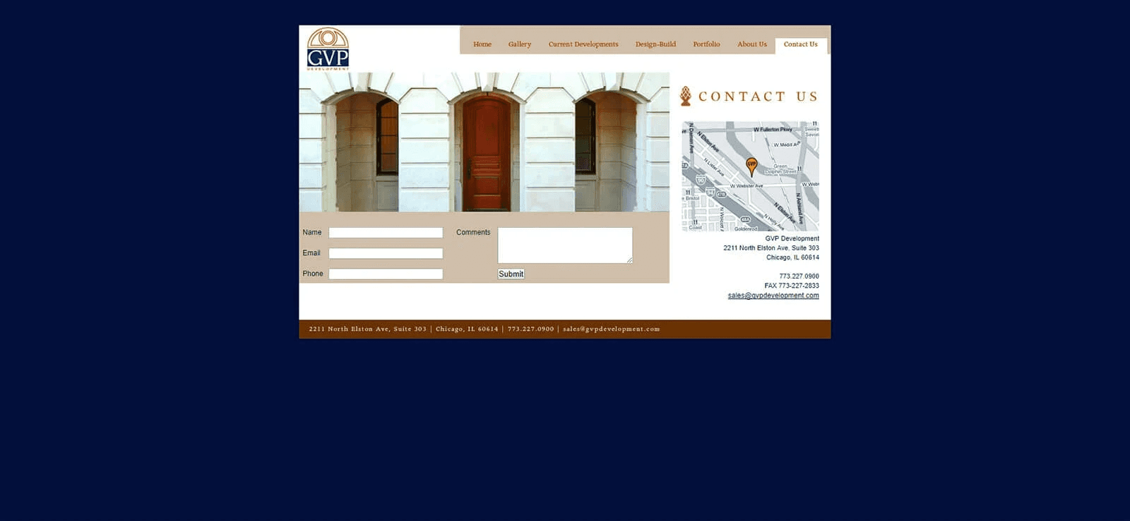
The original website's branding conveyed contemporary elegance that hinted at heritage, using several shades of beige and a sans-serif font. When I asked about the company tag and logo seen at the top of the homepage, I learned that the blocks were supposed to be different shades of brown and symbolize the company's process defined in the tag. There were a couple of issues with this setup.
First, the connection was too subtle; I had not made it and did not expect any potential client to make it. Furthermore, it failed to elevate the brand from its competitors. A basic human principle is that what often matters most in intrapersonal relationships—no matter the context—is how people make each other feel. Assuming this principle could be applied to the relationship between clients and service providers, I gathered that clients want to know what working with this brand would feel like. In fact, it is often the unasked ask and the focus of most advertising brands. "Hey, buy this product 'cause it will make you feel __."
Secondly, if they were looking to develop a luxury home, they probably already had an idea of what services the company was offering. If not, this information could be provided in a process or about page.
I understood that a home page should be invocative, and accomplishing this became my first project mission.


STRUCTURE AND FUNCTION
STRUCTURE AND FUNCTION
Overall, the site was working against the company.
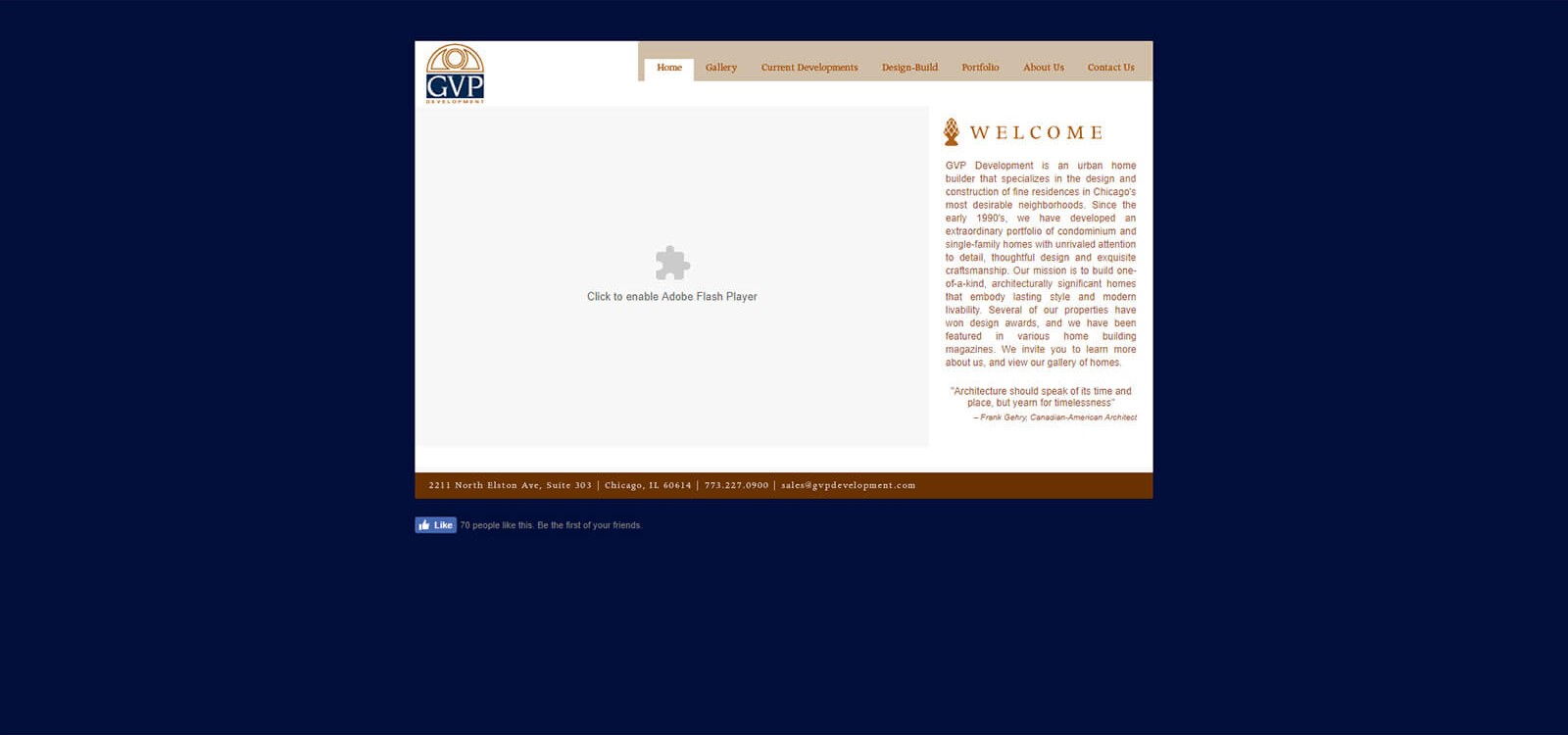
Its structure was simple but dated. It was not responsive, and so it was incompatible with mobile devices. The gallery menu copy was strange. The placement of the name in the top left of the page indicated it would be a homepage link; instead, the three blocks on the top right of the screen were the link. The homepage displayed a menu and a gallery exhibiting the facades of developed homes instead of featuring an overview of the website or including any interiors. Displaying only facades on the home page was counterproductive to promoting the company's interior design services, which they claimed set them apart from their competitors. The information on the other pages had not been updated in years.
I could go on. It was clear that the site needed a lot of changes, and I was determined to deliver my client one that would boost the brand and increase their inquiries.
Competitor Sites
Competitor Sites
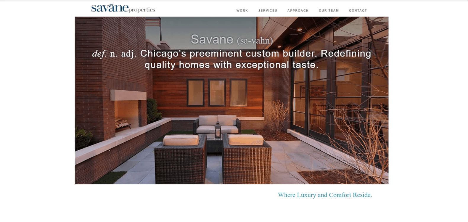
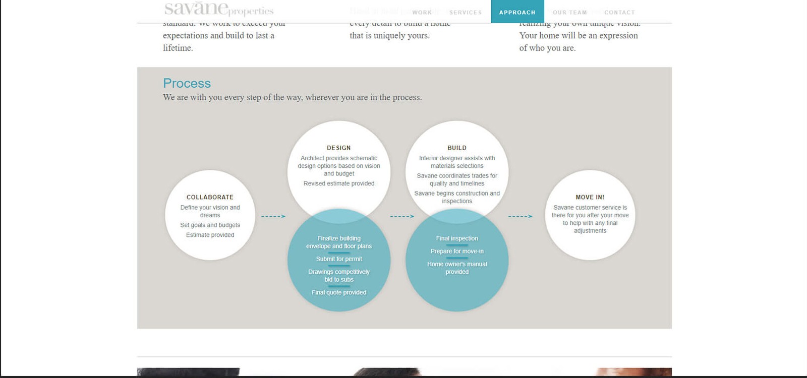
Competitor sites similarly lacked inspiration and unity. They had poor structure, copy that was either unclear or verbose, and poorly curated galleries. The good news was that creating a site that set my client apart from their competitors was a low bar. But I wanted to create something that would last at the top. To do that, I needed to know more about what made websites good.
Competitor sites similarly lacked inspiration and unity. They had poor structure, copy that was either unclear or verbose, and poorly curated galleries. The good news was that creating a site that set my client apart from their competitors was a low bar. But I wanted to create something that would last at the top. To do that, I needed to know more about what made websites good.
Exemplary Sites
Exemplary Sites
To better understand what the site could look like, I reviewed the sites of similar companies recognized as exemplary. I quickly found these sites to have responsiveness, compelling branding, holistic layouts, intuitive user flows, concise copy, strong portfolios, and unique interactions. I selected several features to implement in the new site design, and got started.
To better understand what the site could look like, I reviewed the sites of similar companies recognized as exemplary. I quickly found these sites to have responsiveness, compelling branding, holistic layouts, intuitive user flows, concise copy, strong portfolios, and unique interactions. I selected several features to implement in the new site design, and got started.
Goals
Goals
First, I defined my goals as design principles.
First, I defined my goals as design principles.
Connect with clientele by telling a compelling story through word and image.
Highlight the brand's specialties by promoting the portfolio and interior design services.
Keep the structure intuitive, the layout holistic, and the UX copy concise.
Connect with clientele by telling a compelling story through word and image.
Highlight the brand's specialties by promoting the portfolio and interior design services.
Keep the structure intuitive, the layout holistic, and the UX copy concise.
Site Map
Site Map
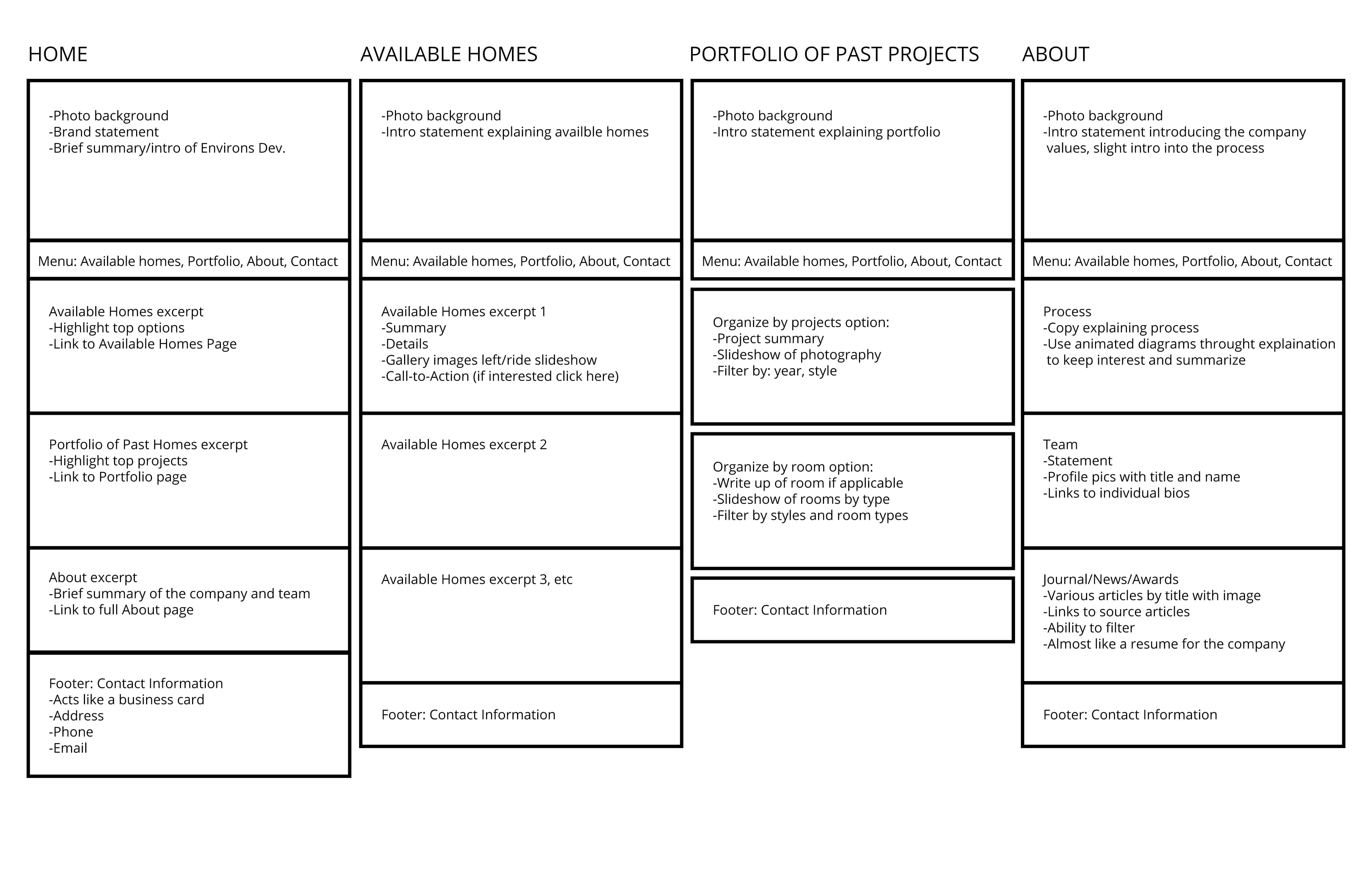
I began with a primary navigational menu and a breakdown of the web pages.
I began with a primary navigational menu and a breakdown of the web pages.


Initial Designs
Initial Designs
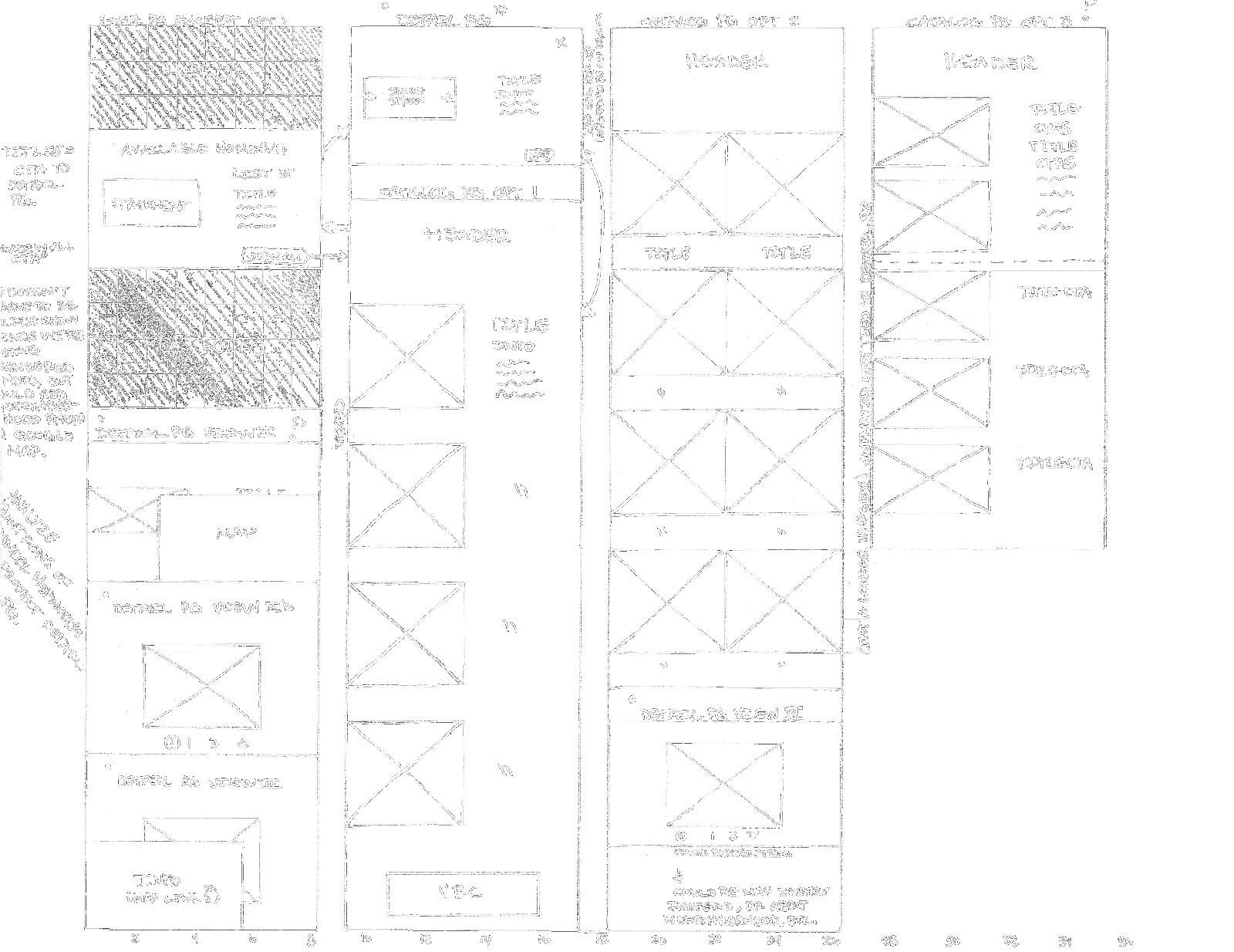
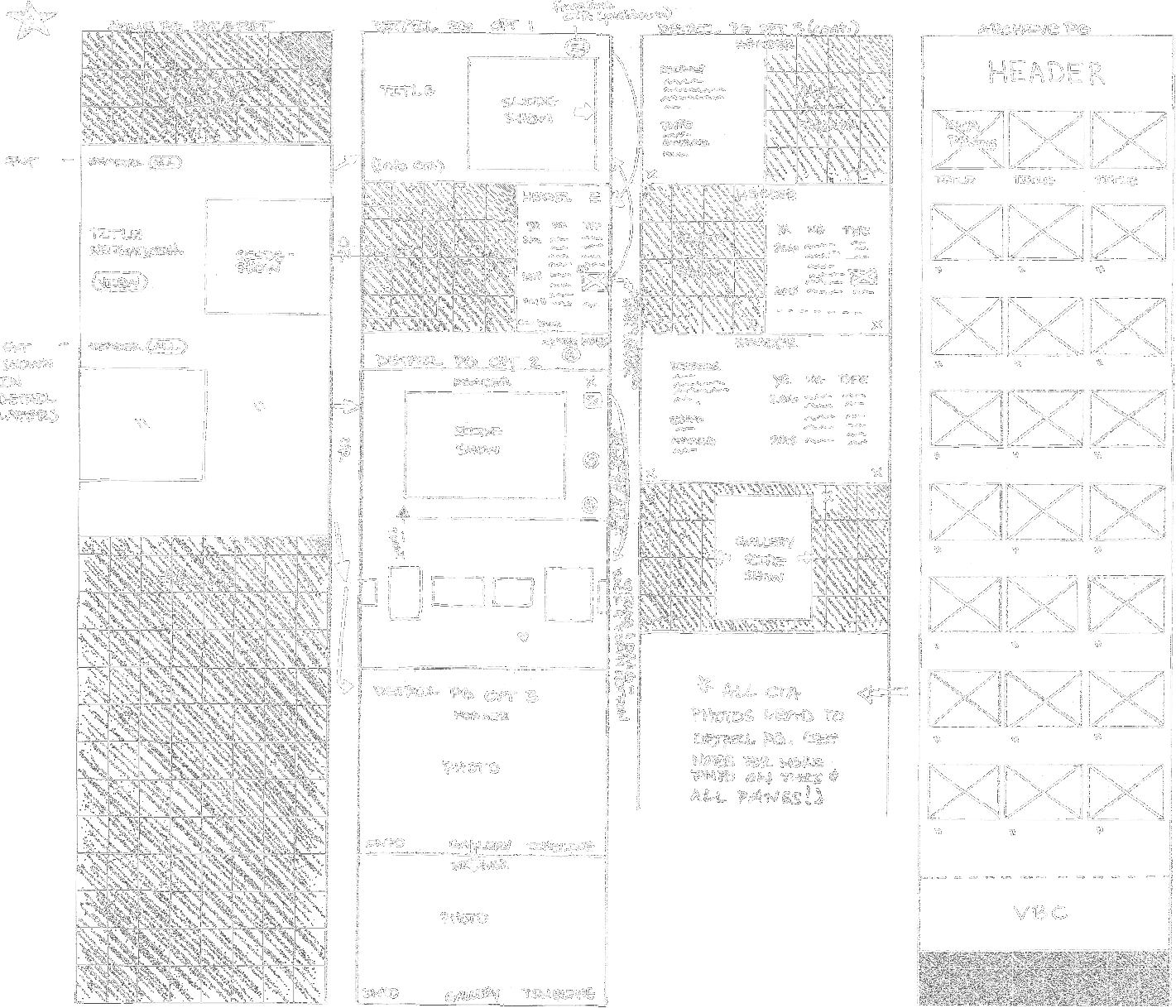
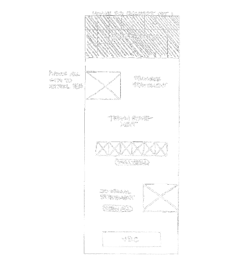
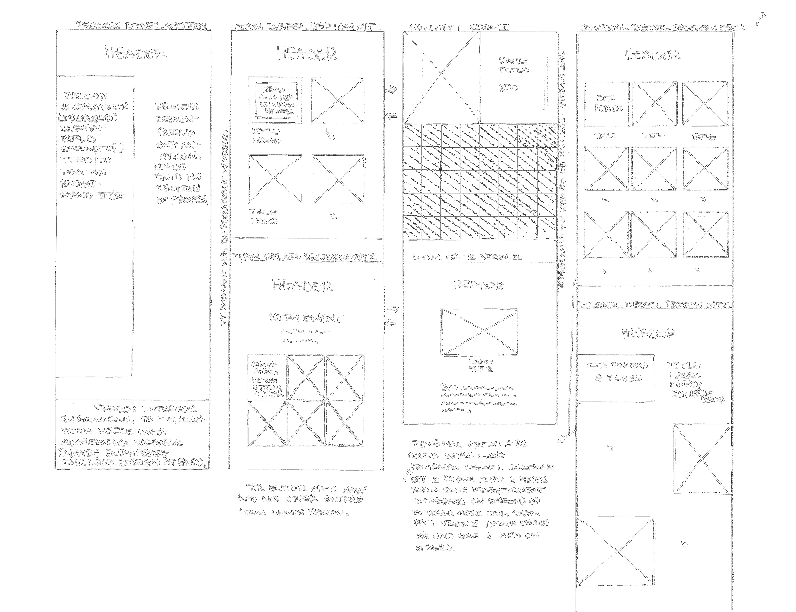
To determine my client's preferences, I then sketched out several site flows following different design options, and discussed the paper prototypes with them.
The sketches may be rudimentary, but the thought behind them was fastidious. I ensured each design included a storytelling flow, a clean layout, and a compelling aesthetic.
The client loved all of the options, but due to the development budget, we scaled back on some of the designs, and I iterated a second design.
User Flow 1
User Flow 2
User Flow 3
User Flow 4
User Flow 1

User Flow 2

User Flow 3

User Flow 4

Iteration
Iteration
For the second design, I compiled research insights, project goals, a quick breakdown of modern design practices, a site outline, and a deck-based prototype, including detailed explanations.
You can view a screen recording of it below.
For the second design, I compiled research insights, project goals, a quick breakdown of modern design practices, a site outline, and a deck-based prototype, including detailed explanations.
You can view a screen recording of it below.
Final Product
Final Product
Follow the link below to view the website as it is today, over five years later, or see the video below to see the finishing product as it was.
https://www.environsdevelopment.com/
Follow the link below to view the website as it is today, over five years later, or see the video below to see the finishing product as it was.
https://www.environsdevelopment.com/
Conclusion
Conclusion
My client was thrilled with the finished product, and I'm proud of what I accomplished in my first user experience job. Since then, both I and the web have continued to evolve. Please see my other projects to see that journey.
My client was thrilled with the finished product, and I'm proud of what I accomplished in my first user experience job. Since then, both I and the web have continued to evolve. Please see my other projects to see that journey.

