BRANDING
BRANDING
LEO BURNETT | 2023
LEO BURNETT | 2023
Marlboro Next Chapter
Marlboro Next Chapter
Marlboro Next Chapter
Style Guide Updates
Style Guide Updates
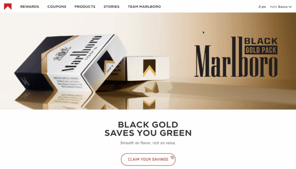
Project Overview
Project Overview
In support of a shift in brand marketing practices and the development of new purchasing products, "Next Chapter" marked Altria changes with a new style guide for their most popular brand—Marlboro.
To knock out two birds with one stone (or reduce production costs), I folded my design system project into this one, collaborating with art directors, developers, and product managers in a quarter-long agile approach involving round-the-clock design-developer iterations.
Despite challenges with workstream barriers (such as a nearly 12-hour time difference with offshore development working against a tight timeframe and a switch in database services amidst building a new design system), the team did a great job. We ended the project with a new look that reflected the client-desired attitude of the new brand direction and a new design system that streamlined a previously fragmented designer-developer workflow.
Prep
Prep
We took the existing style guide and tweaked the interface elements to reflect the new, client-approved brand book.
We took the existing style guide and tweaked the interface elements to reflect the new, client-approved brand book.
The book conveyed a sense of exploration into new territories, portraying cowboys watching the horizon or riding in the distance. We played with colors and shapes, softening our corners and typography to allude to a brighter future.
The team required several rounds of iteration to correct conflicts with development.
The most widespread conflict was our use of inflexible components, which resulted in the team pushing some upgrades past the Marlboro style guide delivery date.
I have included screenshots and detailed views of the style guide, including magenta work-in-progress definitions. Additionally, I included screenshots of the Adobe XD library, which I created in the other project and which supported this effort.
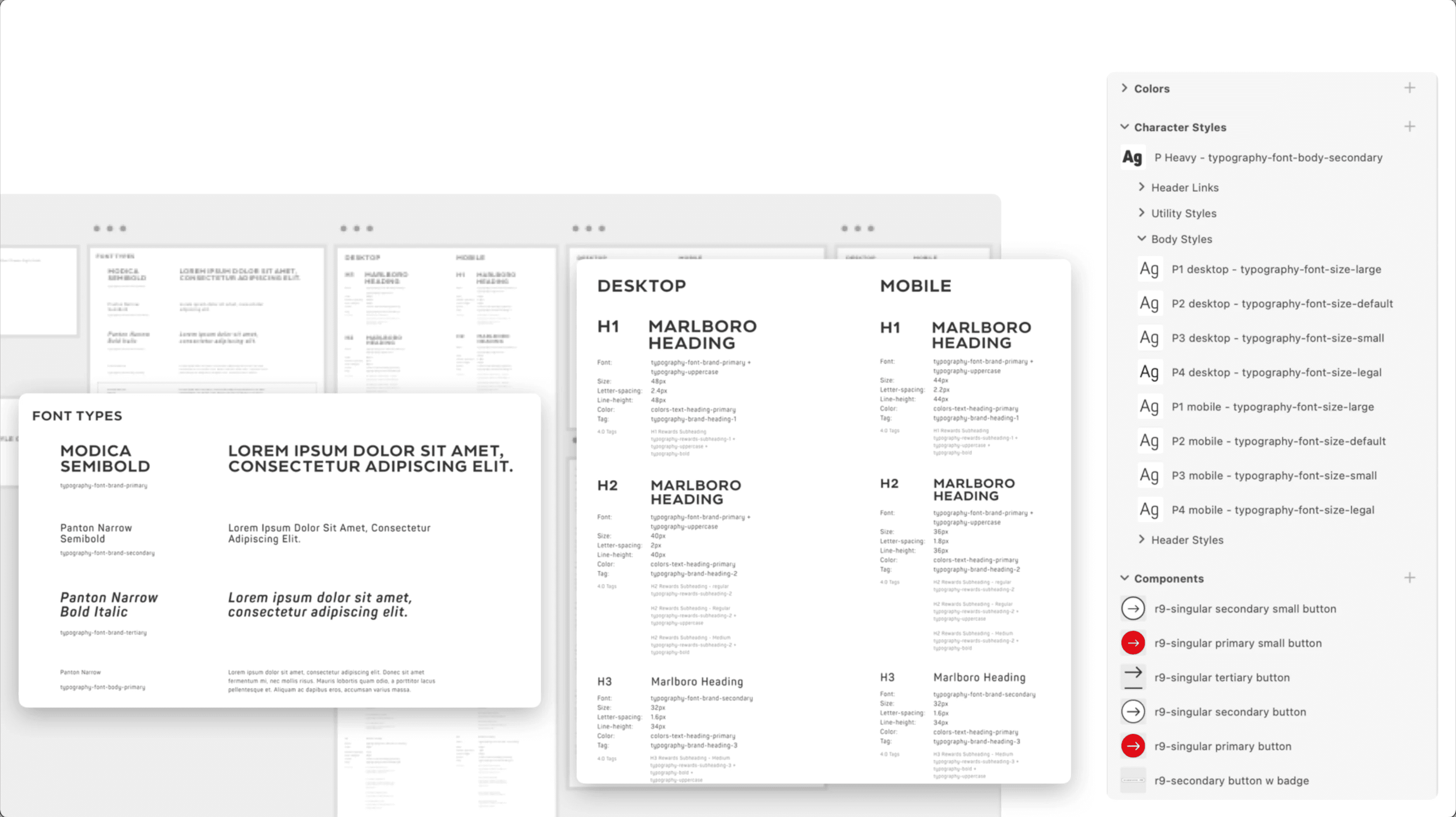


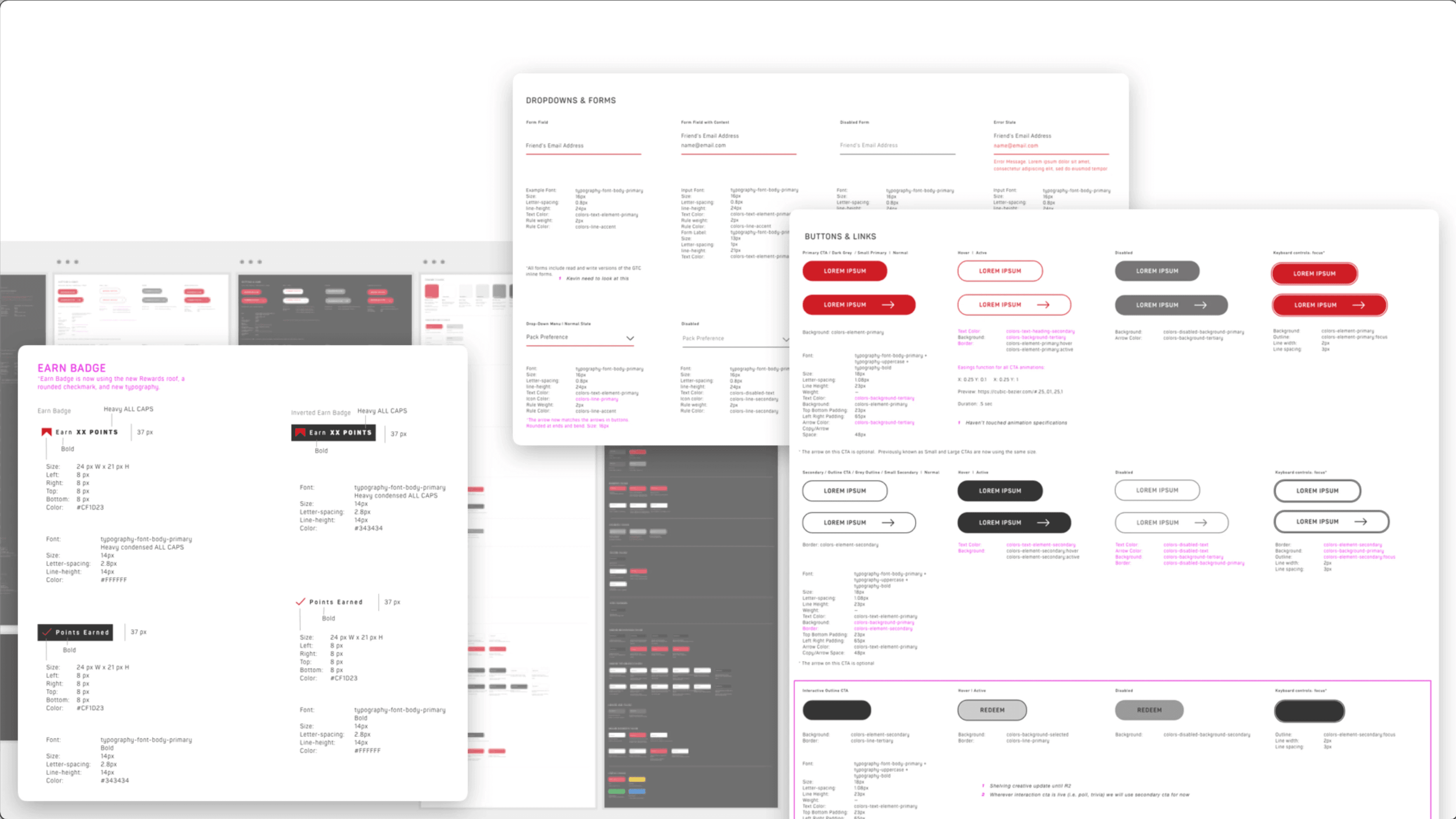


We then built the pattern library to serve as a simple tool for internal brainstorming.
We then built the pattern library to serve as a simple tool for internal brainstorming.
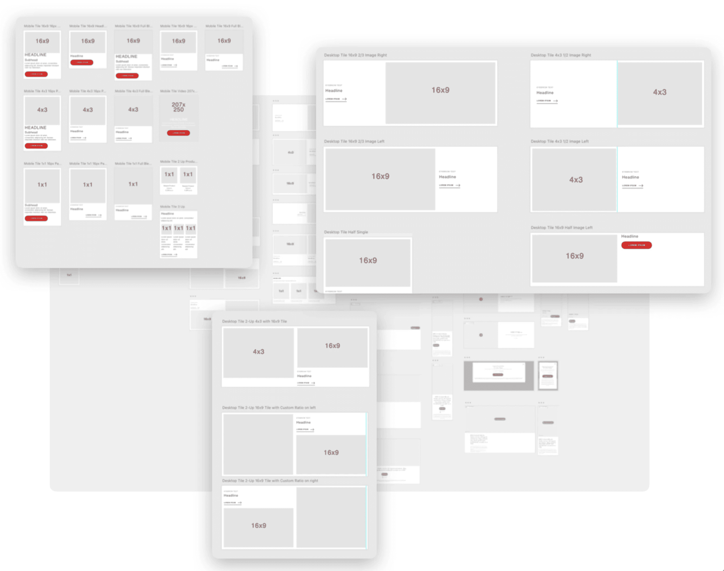
The library project resulted in two libraries: a technical library and a pattern library. The technical library served the UX designer and development teams, while the pattern library served as a branded but simplified component library for the non-UX designer team. Below are some component wireframes that could be pulled from the cloud library for easy wireframe building and internal brainstorming sessions.
The library project resulted in two libraries: a technical library and a pattern library. The technical library served the UX designer and development teams, while the pattern library served as a branded but simplified component library for the non-UX designer team. Below are some component wireframes that could be pulled from the cloud library for easy wireframe building and internal brainstorming sessions.


The Results
The Results
Examples of three major areas for visual enhancement include signage, modals, and layout.
Examples of three major areas for visual enhancement include signage, modals, and layout.
Old Signage - The video player
Old Signage - The video player
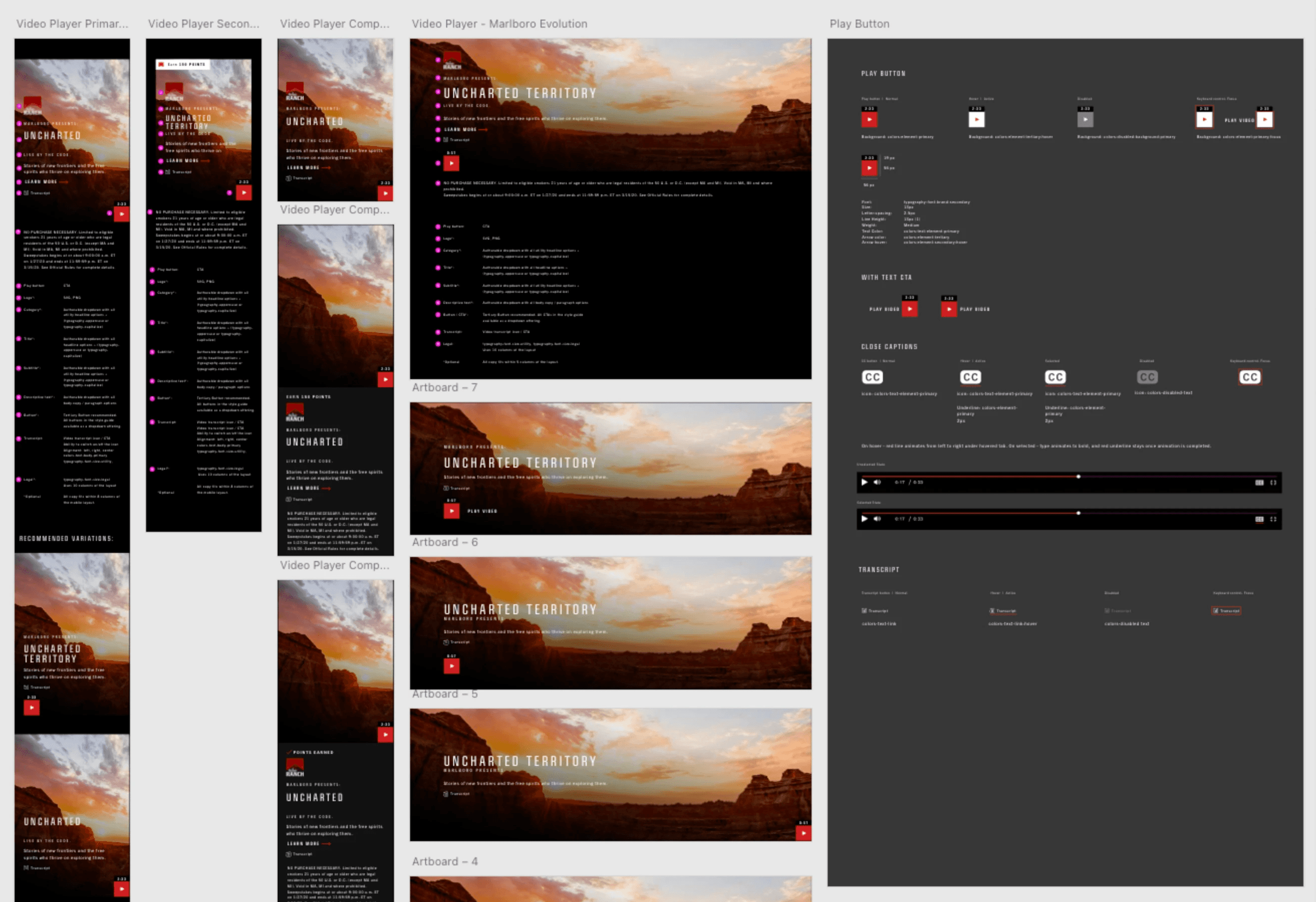


The old look conveyed a masculine, mysterious brand with rectangular condensed font, squared buttons, and a black page background that used black gradients for imagery.
Below you can see an example of the video player and how it looked with the old style guide.
The old look conveyed a masculine, mysterious brand with rectangular condensed font, squared buttons, and a black page background that used black gradients for imagery.
Below you can see an example of the video player and how it looked with the old style guide.
New Signage - Indicative tiles
New Signage - Indicative tiles
We lightened the palette and rounded corners and typography, as well as increased flexibility through more button variations and some icons for easy scanning.
The video below show displays how we edited the our tiles to indicate which were used for articles, videos, or voiceovers. We also positioned some hero tile gifs to some of our pages to make the pages feel more alive.
Modals
Modals
The survey exemplifies where we pushed beyond interface enhancements and improved user experience. Per my suggestion, we added a progress bar—a simple but helpful practice.
The survey exemplifies where we pushed beyond interface enhancements and improved user experience. Per my suggestion, we added a progress bar—a simple but helpful practice.
Layout
Layout
The homepage is an excellent place to review the site's overall aesthetic.
It shows how we wanted a page to behave and how we used the new style guide to create movement and a more lively look.
While the new style guide worked nicely, there was room for improvement, such as vertical spacing and grid use. For example, we broke the grid in anticipation of adding parallax scrolling. Unfortunately, we faked the effect with auto-timed animation instead of getting parallax scrolling, giving the page a broken look.
Another area for improvement with the new style guide was the need for more unity and cohesion. Multiple directors and designers were using the new style guide floor-wide without thorough design rules and guidelines from the UX team. The lack of cohesion was apparent across the site, and it could be seen in details like the inconsistency of our eyebrow headers.
Conclusion
Conclusion
The team struggled with design debt and alignment but conveyed the desired aesthetic through the new style guide.
The team struggled with design debt and alignment but conveyed the desired aesthetic through the new style guide.
