UX | IA
UX | IA
INTOUCH SOLUTIONS | 2019
INTOUCH SOLUTIONS | 2019
Pharmeceutical Application
Pharmeceutical Application
Pharmeceutical Application
Diagnostic Information Presentation
Diagnostic Information Presentation
Project Overview
Project Overview
Here, I was hired on as an Art Director to provide support for a company working on a fast-paced project. My employer's client needed an interactive medical iPad app which would provided customizable doctor-to-doctor presentations.
Here, I was hired on as an Art Director to provide support for a company working on a fast-paced project. My employer's client needed an interactive medical iPad app which would provided customizable doctor-to-doctor presentations.
Kickoff
My initial task was to create a concise style for the client to review. Another contractor was also assigned this task. After client review, we each created a new iteration. Our second iterations were reviewed internally. My style was selected for the second client review and approved by the client.
My initial task was to create a concise style for the client to review. Another contractor was also assigned this task. After client review, we each created a new iteration. Our second iterations were reviewed internally. My style was selected for the second client review and approved by the client.
Early Iterations
Early Iterations
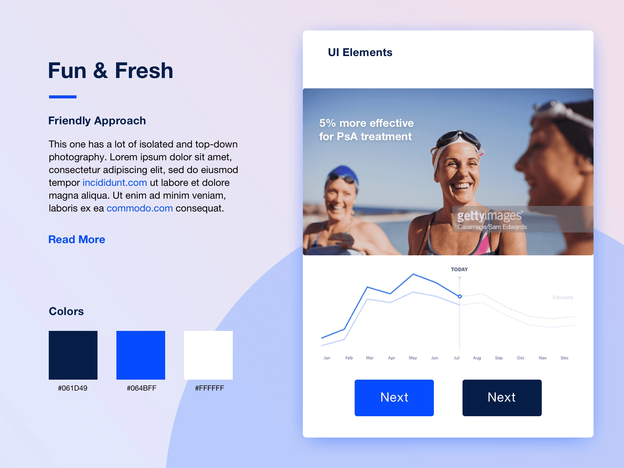


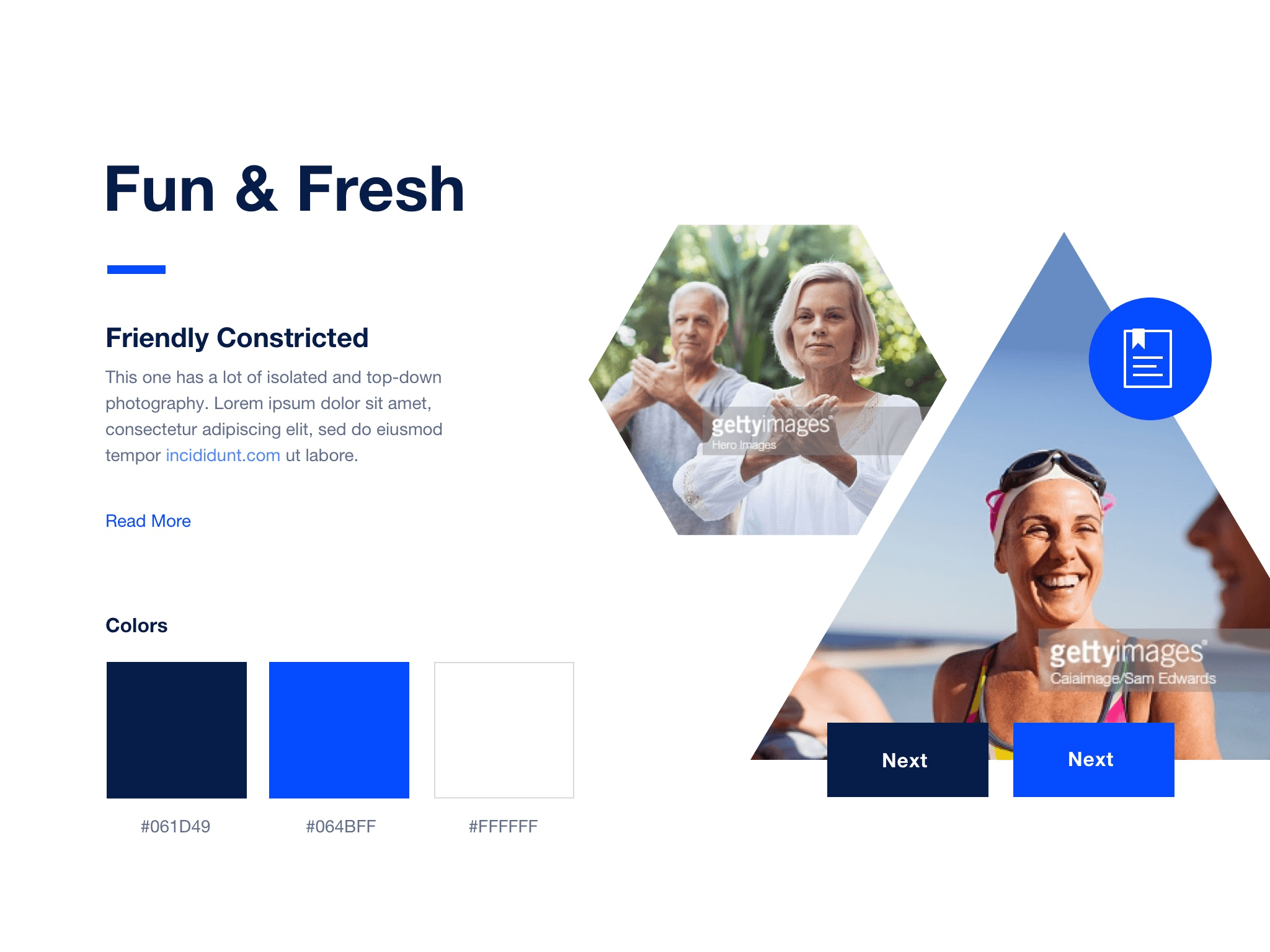


I aimed to provide a varied approach to design in both style and hierarchy. I was told to stick with the company's font and colors.
I aimed to provide a varied approach to design in both style and hierarchy. I was told to stick with the company's font and colors.
Iteration 1
Iteration 1
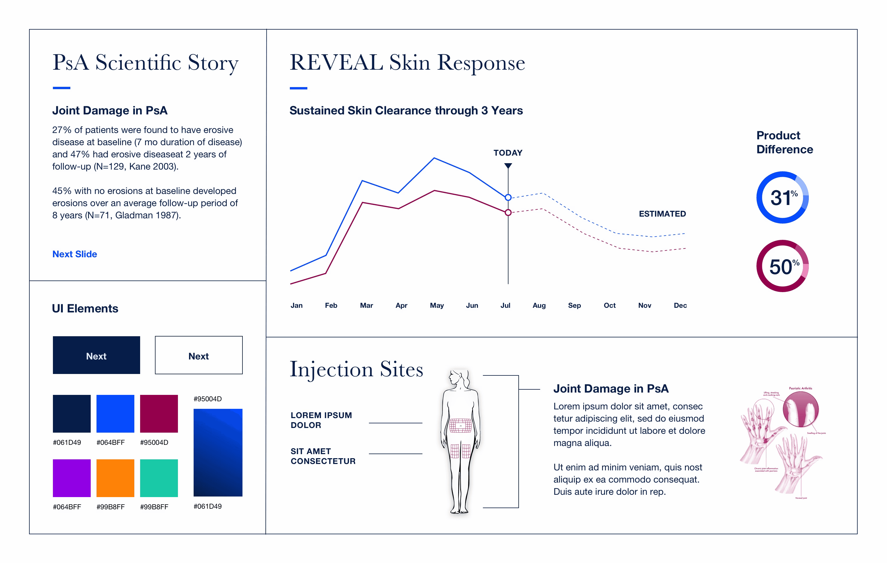


Given the nature of the content for the final product, I wanted to provide examples of layout and style. I played with the typography of the headers to increase hierarchy, and my provided color palette kept the company's secondary colors as options to consider.
Given the nature of the content for the final product, I wanted to provide examples of layout and style. I played with the typography of the headers to increase hierarchy, and my provided color palette kept the company's secondary colors as options to consider.
Iteration 2 Warm-up
Iteration 2 Warm-up


The client wanted to stick to a sans serif font much like what I provided, and they preferred their primary colors.
The client wanted to stick to a sans serif font much like what I provided, and they preferred their primary colors.
Iteration 2 and 3
Iteration 2 and 3


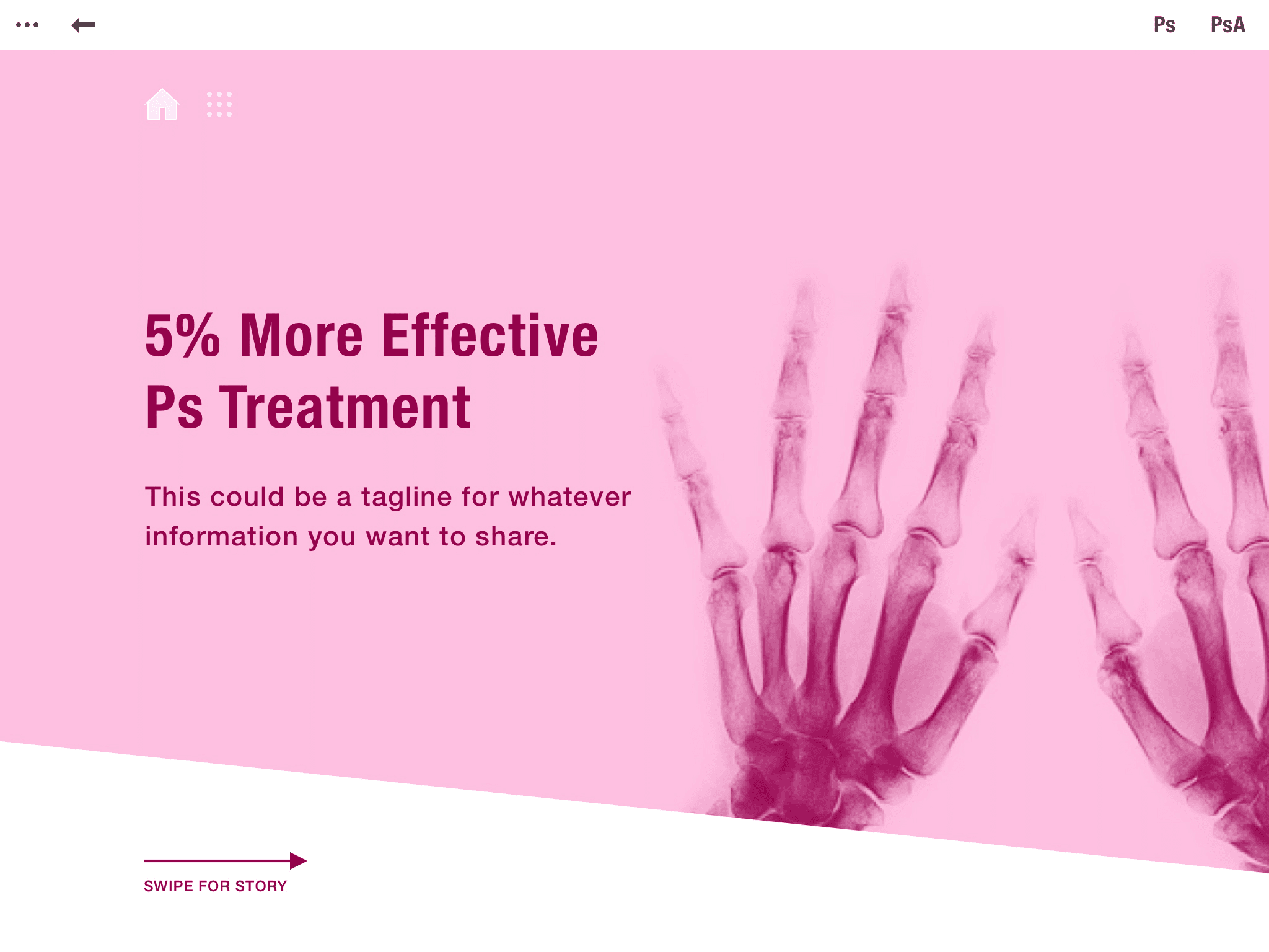


Due to the client's feedback of Iteration 1, I provided the client with dense color. With further feedback, I pulled back the color to leave them grayer.
Due to the client's feedback of Iteration 1, I provided the client with dense color. With further feedback, I pulled back the color to leave them grayer.
In the Weeds
In the Weeds
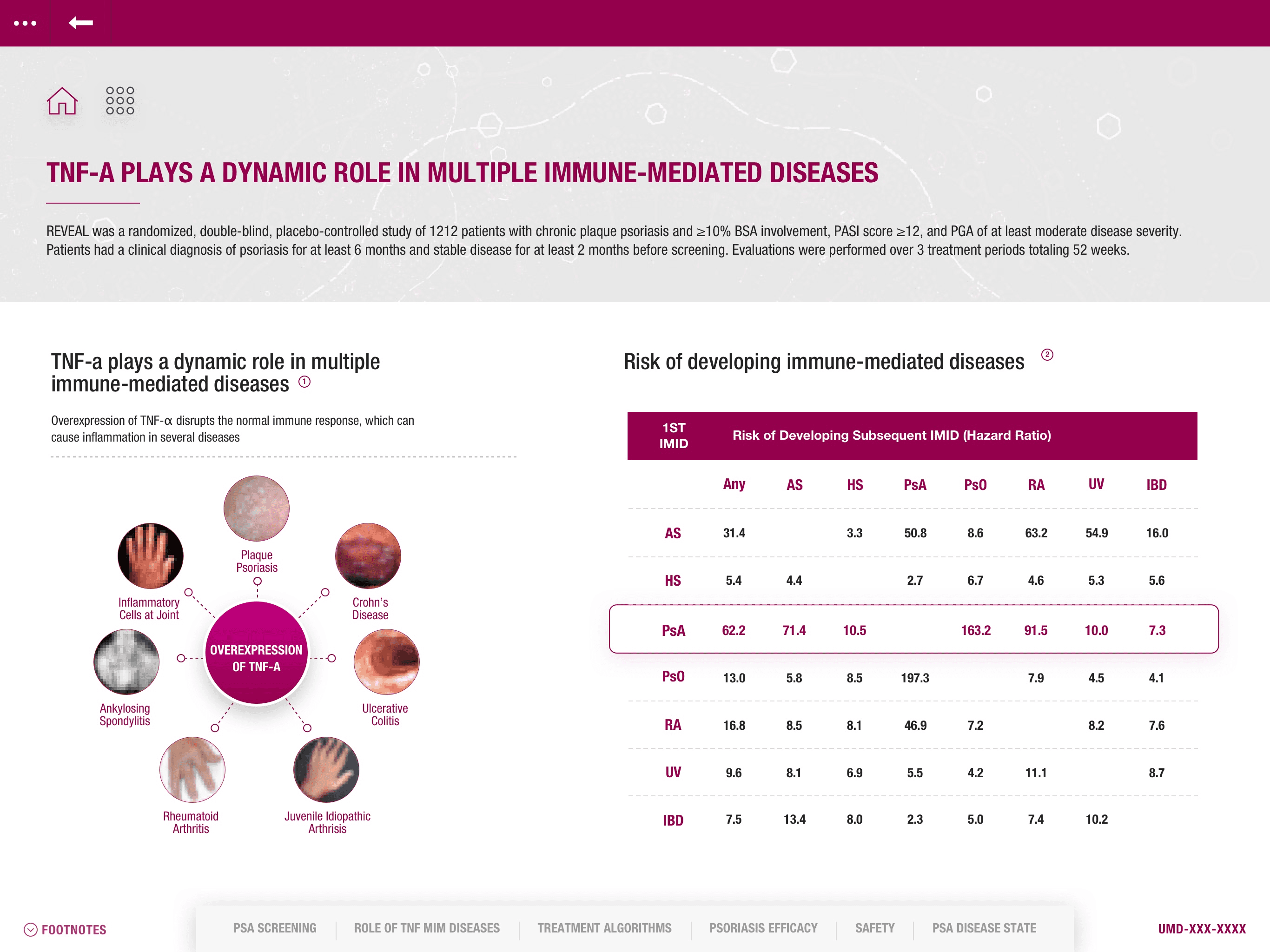
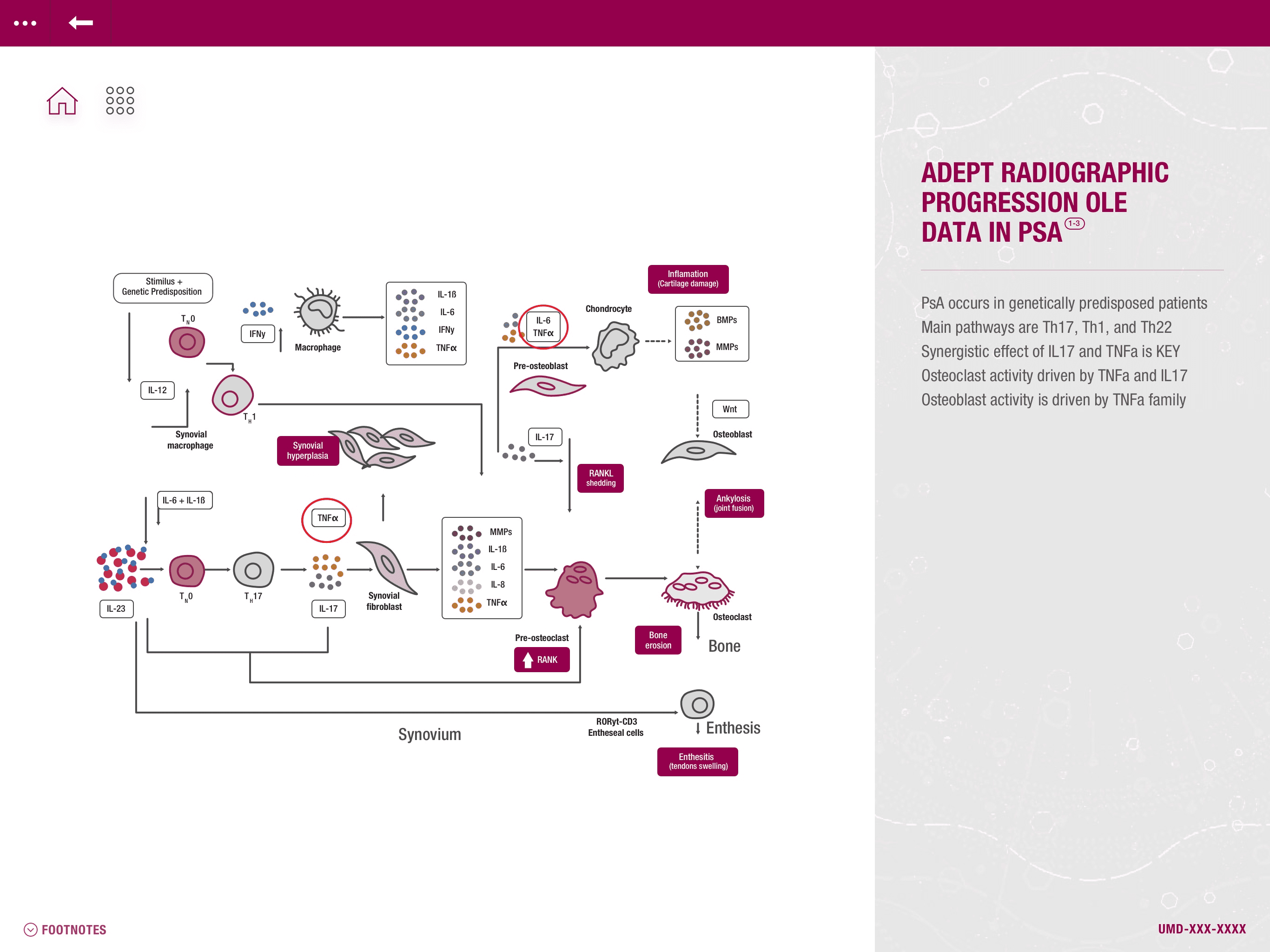
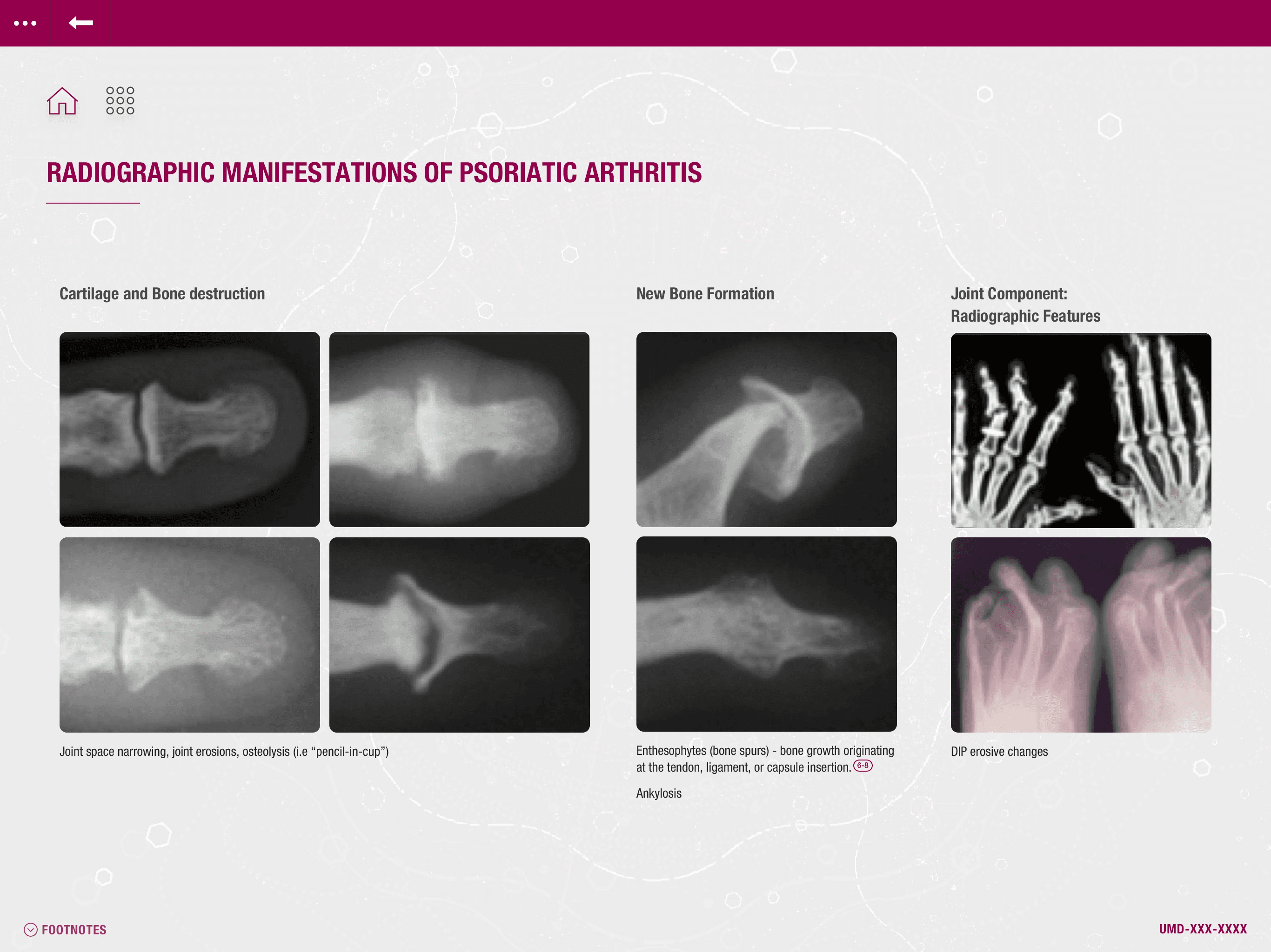
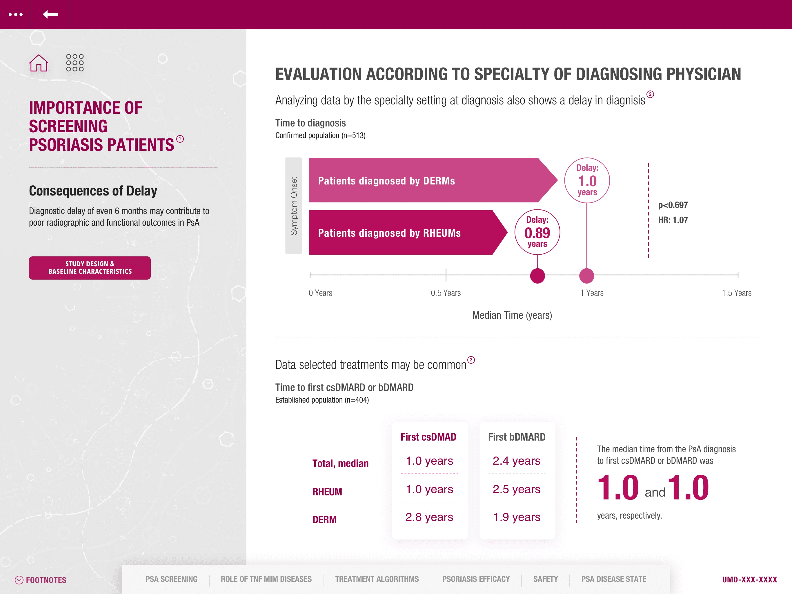
Following this, the other contractor and I worked together with company employees—a Creative Art Director and a copywriter—to build out all of the slides for the application. I took charge of the placement of UI elements and filling in the copy on templates while the other contractor applied my style direction to client-provided graphs and figures.
Our challenge was to provide a clean aesthetic despite the volume of information per slide and also to create a concise aesthetic throughout the different figures given by the client.
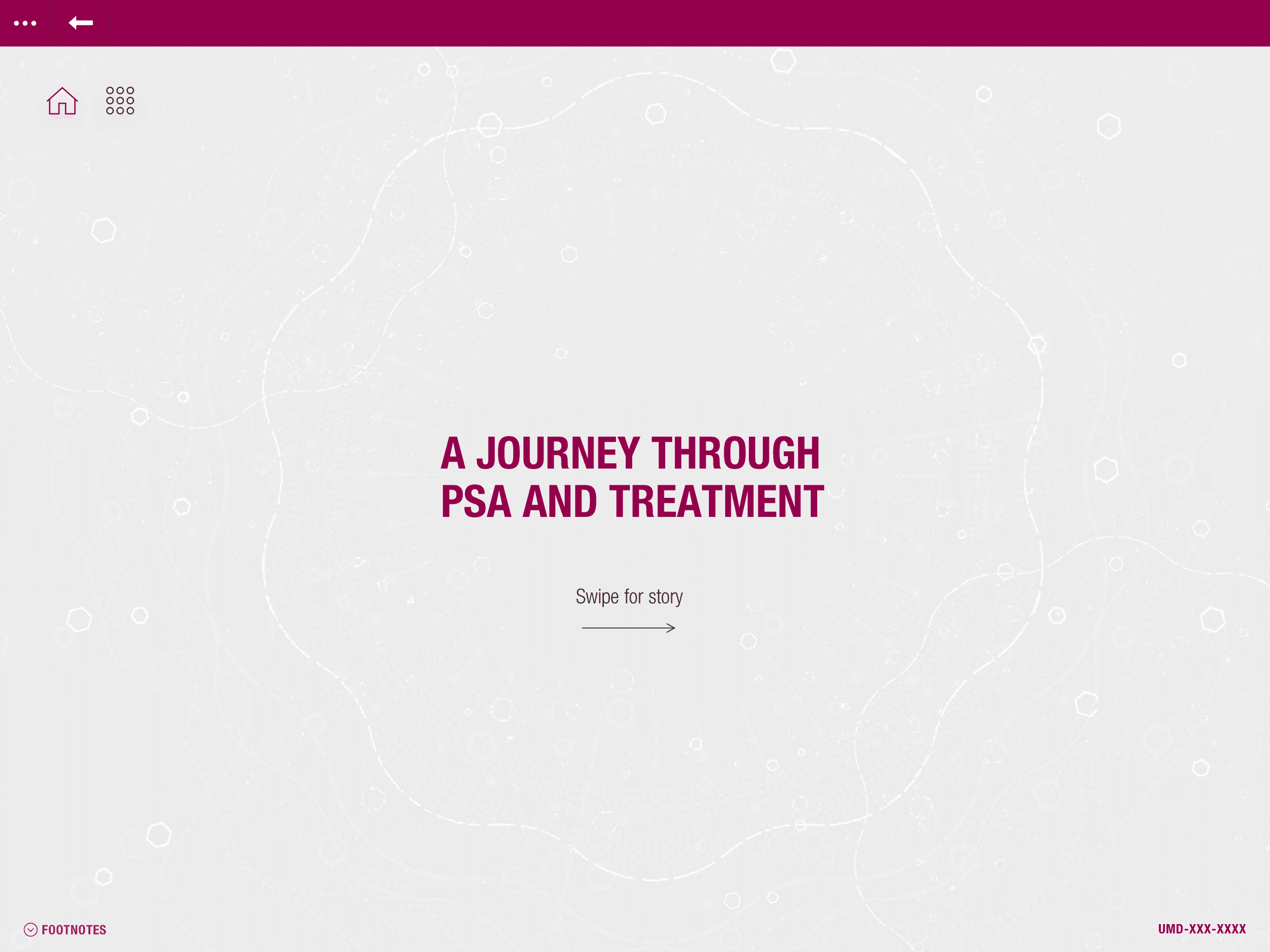
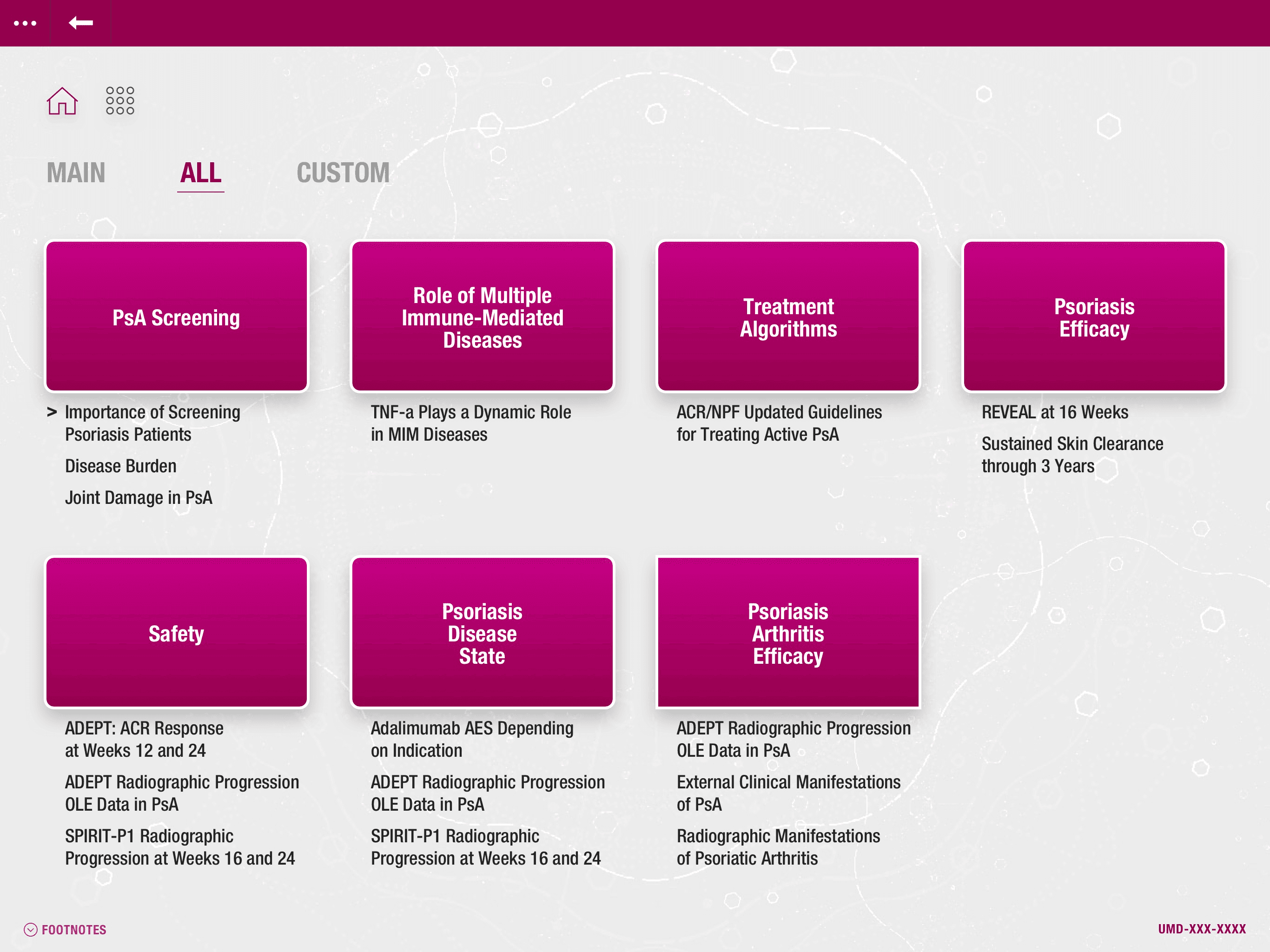
Home & Selection Screens
Home & Selection Screens




Reference Block Inactive vs Active
Reference Block Inactive vs Active


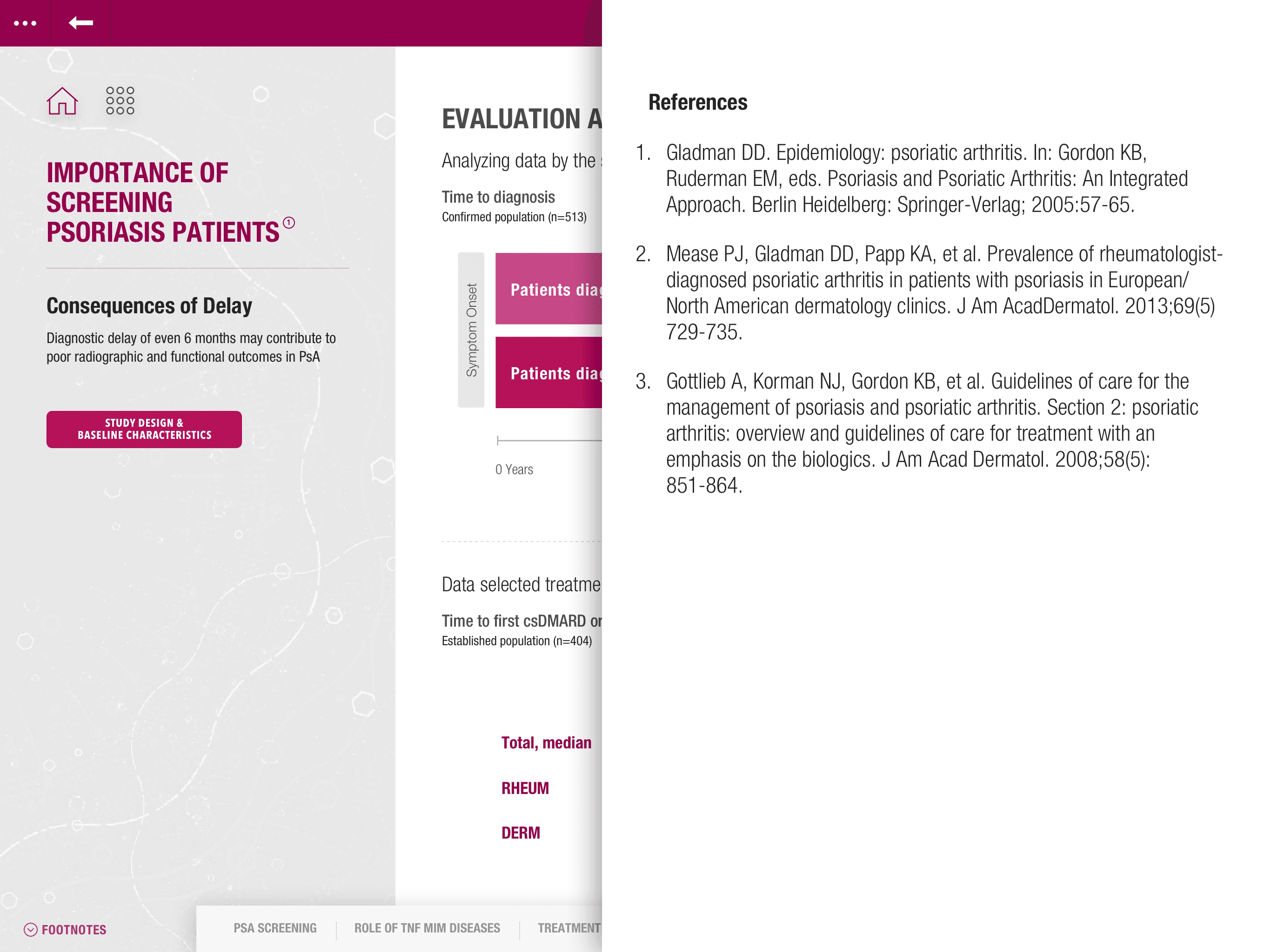


Reference Overlay Inactive vs Active
Reference Overlay Inactive vs Active
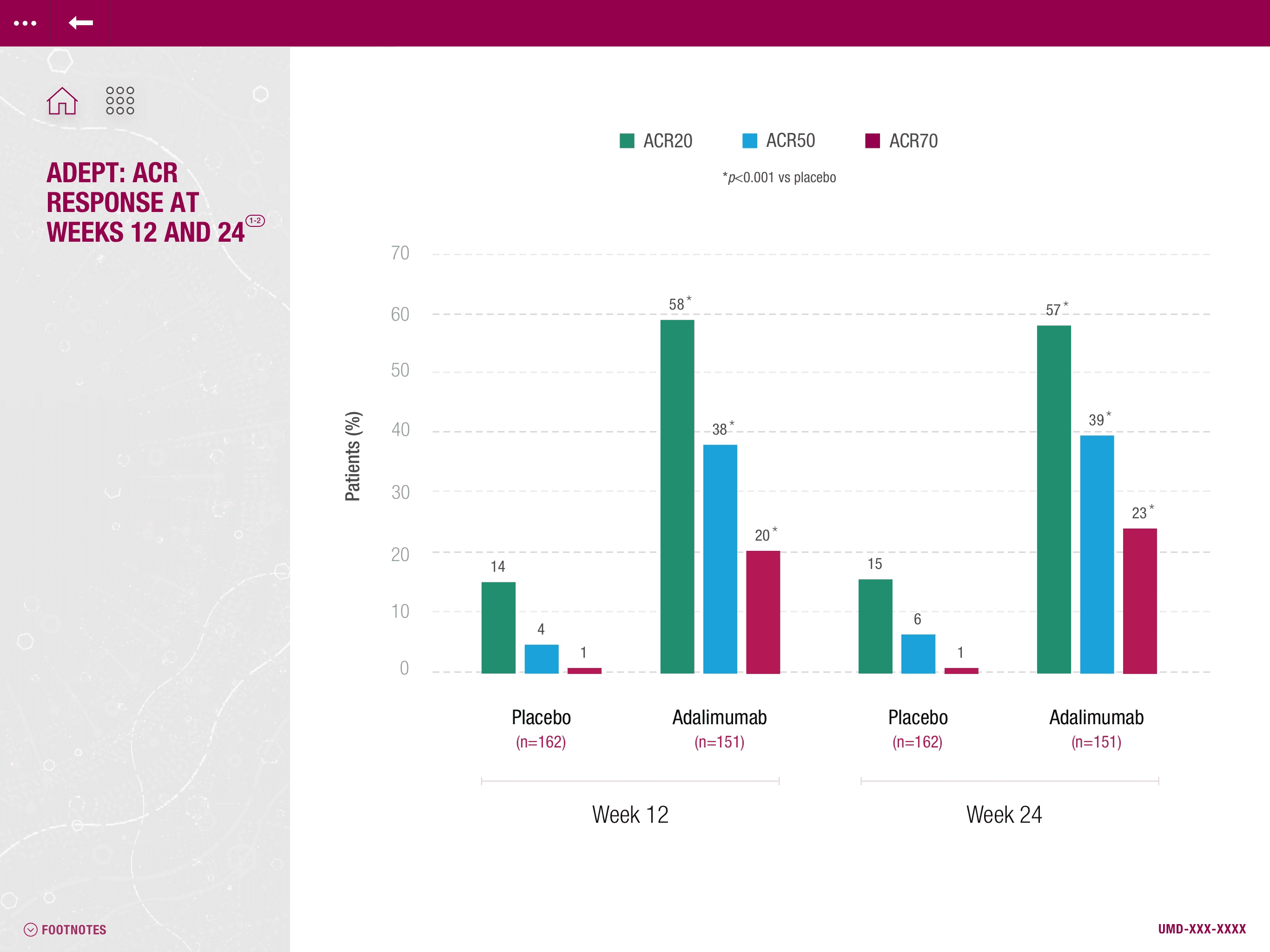


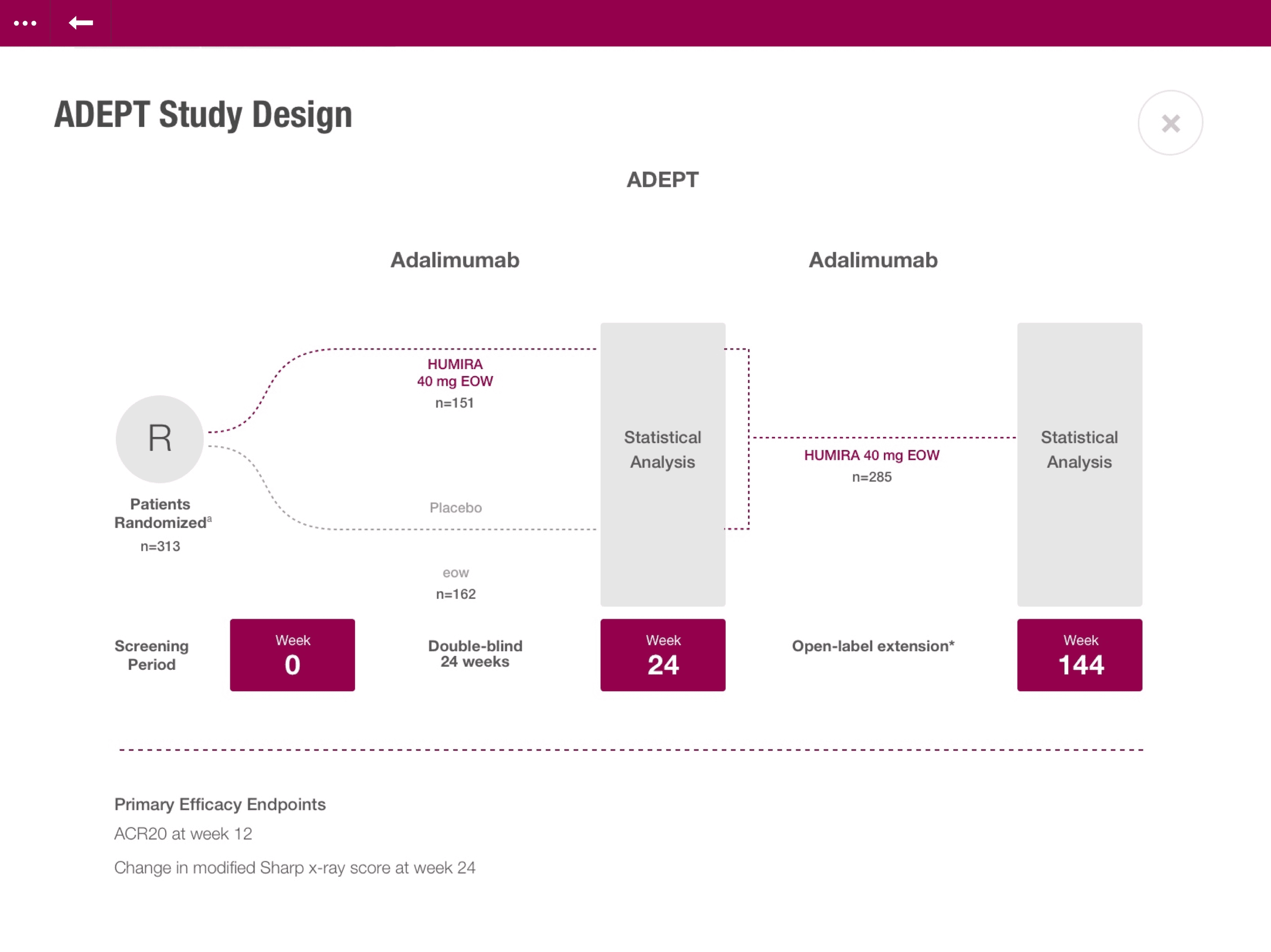


Various Slides
Various Slides
Final Stretch
Final Stretch
Once the project was in a comfortable place, we were assigned with creating a Sketch library the company team could use to complete the project.
Once the project was in a comfortable place, we were assigned with creating a Sketch library the company team could use to complete the project.
Conclusion
Conclusion
My talent sharpened by getting to work on a fast-paced project with tight deadlines. Knowing that the company and the client appreciated my style direction and that I was able to swim in choppy waters, I am confident moving forward. Moreover, I am glad that I left the company in a secure place. I hope to take part in challenging projects shortly.
My talent sharpened by getting to work on a fast-paced project with tight deadlines. Knowing that the company and the client appreciated my style direction and that I was able to swim in choppy waters, I am confident moving forward. Moreover, I am glad that I left the company in a secure place. I hope to take part in challenging projects shortly.


